3D Network Map Visualization
Role: Product Designer & Frontend Engineer
Tools: Mapbox GL JS, Three.js, Figma, React
Timeline: 3 months
Team: Myself (Design + Frontend), 1 Backend Engineer, 1 Product Manager
Background
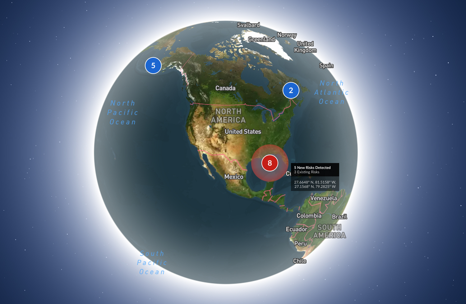
Our team was tasked with enhancing an existing network monitoring platform that tracks and visualizes global infrastructure assets — satellites, ships, ground stations, and communication nodes.
Previously, the product relied on a flat, 2D map with dense overlays and limited spatial context. Users could view alerts, connections, and asset statuses, but it was difficult to grasp relationships between assets, especially those operating in different orbits or altitudes.
The goal:
Introduce a 3D interactive map that makes complex network topologies intuitive to explore, while seamlessly integrating into the existing product ecosystem.
Objectives
- Visualize global network assets (satellites, ships, ground stations, etc.) in 3D space
- Show live network health indicators — latency, link quality, and anomaly alerts
- Maintain performance and clarity with potentially thousands of assets
- Create a visually rich experience without disrupting existing workflows
Research & Insights
I began by interviewing users — network operators and analysts — to understand their mental models:
- They wanted a sense of “where and how” issues propagate spatially
- Many used multiple map layers in other tools to mentally visualize relationships (e.g., orbits vs. ground paths)
- They preferred realistic but functional visualizations, not just aesthetic 3D
These insights led to a core design principle:
"3D should clarify, not decorate."
Design Process
1. Information Architecture
- Restructured how asset data was grouped and surfaced
- Each asset type (satellite, ship, station) used consistent metadata panels
- Alerts and metrics unified under a single “signal” system for visual consistency
2. Wireframes & Interaction Flow
- Defined user transitions between dashboard and 3D view
- Designed contextual overlays for status and anomaly indicators
- Added zoom-based detail control, so detail increases with proximity
3. Visual Exploration
- Experimented with depth and lighting cues to communicate altitude
- Used color-coded connection lines for network routes
- Developed iconographic low-poly 3D models for recognizable assets (satellites, ships)
Engineering Implementation
As the frontend engineer, I implemented the design using:
- Mapbox GL JS for base geospatial rendering and coordinate projection
- Three.js layered on top for custom 3D models, lighting, and animation
- A React wrapper to dynamically toggle between 2D and 3D modes
Technical Highlights:
- Performance: Implemented level-of-detail (LOD) management and lazy loading for 3D models
- Lighting: Synced Mapbox and Three.js lighting environments for cohesive visuals
- Data: Integrated real-time updates via WebSocket streams for live network state changes
Outcome
The 3D map became a core differentiator of the platform.
- Operators could visualize network dependencies spatially, reducing investigation time by ~40%
- The 3D models made system monitoring more intuitive and engaging, especially for onboarding and presentations
- Inspired further work on predictive visualizations, like projected orbits and link degradation forecasting
Reflection
Balancing design clarity with technical feasibility was the biggest challenge.
This project reaffirmed my passion for bridging design and engineering — using interactive visualization to make complex systems understandable.
It also demonstrated how tools like Mapbox GL and Three.js can transform traditional monitoring dashboards into immersive analytical experiences.