Redesigning Platform Architecture: From Single-Page Chaos to a Productized Multi-App Framework
Context
When I joined Swoop as their first designer, the company was at a critical inflection point. After eight years of development, the business team was ready to productize the platform and take it to market. Their proposed strategy was an a-la-carte model: breaking the platform into discrete "apps" that customers could purchase individually based on their specific operational needs, rather than forcing them to buy the entire suite of capabilities.
This approach made commercial sense—why force customers to pay for features they'd never use? It therefore revealed a significant challenge with the product itself. The engineering team had built powerful technologies over the years, but had consolidated virtually all functionality into a single-page application. As features accumulated, this monolithic approach had created an increasingly overwhelming, messy user experience, with every capability competing for space and attention on one screen.
Behold, the chaos:
To tackle this, I led a design sprint with the UX team to develop a framework that would solve this challenge.
Defining The Problem
The core question was multifaceted: How could we transition from this chaotic single-page application to a modular, app-based architecture that enables the business team's a-la-carte productization strategy? And rather than allowing business requirements to constrain the experience, could we leverage this transition to actually enhance usability while making each app's value proposition clear enough to justify individual purchases?
We needed a framework that would simultaneously:
- Support the a-la-carte business model by clearly delineating app boundaries
- Improve user experience by reducing interface complexity
- Make the value of each app immediately apparent to potential buyers
- Scale as new apps were developed and brought to market
Current State Assessment
We identified several critical issues with the existing single-page application:
- Extreme visual clutter: Eight years of feature additions had turned the interface into an overwhelming, chaotic experience. Every capability—from basic monitoring to advanced configuration tools—competed for space on a single screen, creating a dense, difficult-to-navigate interface
- Feature bloat without structure: Years of agile development had resulted in functionalities being built incrementally and "glued together" without a cohesive information architecture. The UI had evolved into a patchwork of disparate elements rather than a coherent system
- Lack of personalization: Not all customers needed every feature, yet the single-page approach forced everyone to wade through the entire interface. Within each customer organization, certain users only needed access to specific subsets of functionality, but had no way to filter out irrelevant controls
- Cognitive overload: The messiness of presenting all capabilities simultaneously to all users dramatically increased cognitive load, making even simple tasks require significant mental effort to locate the right tools
Research & Analysis
User Research & Personas

From previous user research, we reiterated the identity of our two distinct user types within our customer organizations:
Test
Goals
- •a
- •b
Frustrations
- •a
- •b
- •c
1. Administrators/Technicians
These users possess deep technical knowledge of their systems. They configure rules, manage data governance, and control how information can be securely transferred and operated upon. Their work establishes the foundation for system operations.
Examples: systems engineers, network architects, or IT administrators who define the parameters within which operations occur.
2. Operators
These users interact with the pre-configured systems to monitor real-time data, identify anomalies, and make time-sensitive decisions.
Examples: field operators, NOC (Network Operations Center) analysts, security monitors, and customer support teams who need to act on live information without modifying underlying configurations.
While some overlap exists, these roles typically require specialized expertise and rarely intersect in practice. This insight was crucial: surfacing irrelevant controls to users not only cluttered the interface but actively impaired their ability to perform their jobs effectively.
Mapping Core Functionalities
We audited all existing platform capabilities and grouped them into two fundamental categories:
- Configuration: Tools for setting up systems, defining rules, and managing infrastructure
- Monitoring/Operations: Interfaces for observing system performance, detecting anomalies, and taking action
Defining App Structure
Working with the product and business teams, we mapped features to specific apps based on customer needs and purchasing patterns. As we organized functionalities into their respective apps, a pattern emerged: every app required elements from both the Configuration and Monitoring buckets.
More specifically, we identified two universal workflows across all apps:
- Setup Process: A robust configuration layer allowing administrators to define rules, introduce data, and establish operational parameters
- Operational Layer: An interface where operators monitor performance, analyze data patterns, receive intelligent alerts, and coordinate responses
This alignment between workflows and personas became the foundation of our solution.
The Solution: A Dual-Layer Architecture
Core Framework
To reduce cognitive noise and optimize each user's experience, we separated the platform into two primary views:
- Configure: The administrative layer for system setup and management
- Operate: The operational layer for monitoring and real-time decision-making
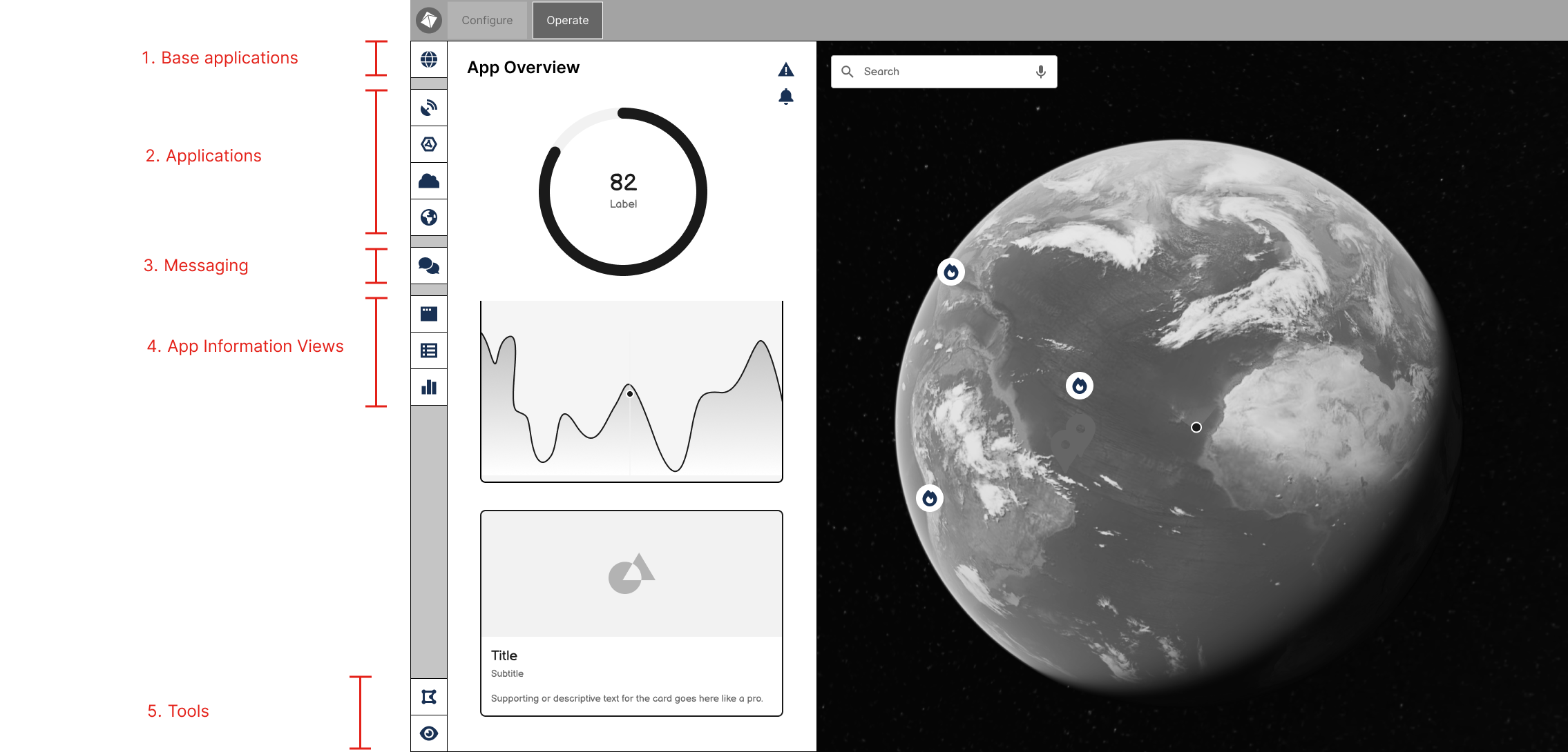
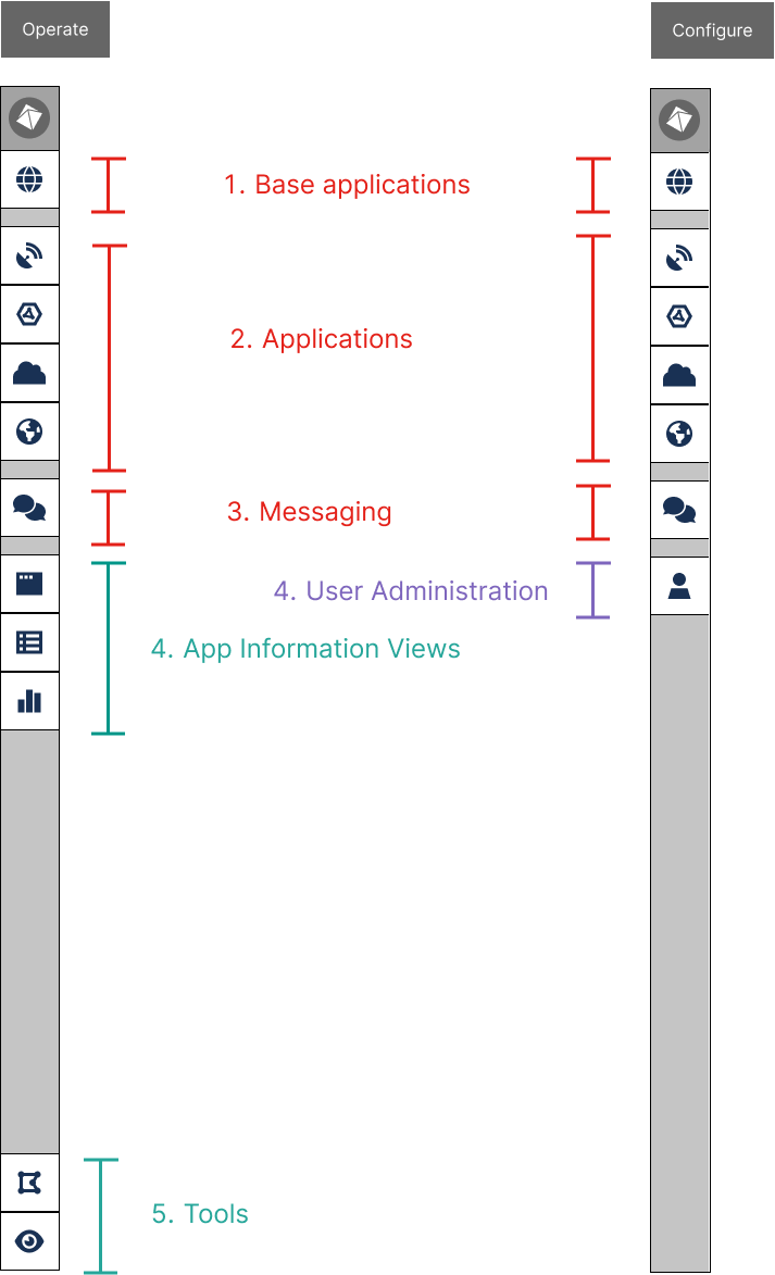
Navigation Structure
We designed a unified navigation system that would make app boundaries explicit while maintaining consistency across the platform. This structure served dual purposes: improving usability while clearly communicating what customers were purchasing.
1. Base Application: Core functionality available to all users, establishing baseline platform value
2. App Navigation: Clear access to purchased apps, each representing a distinct capability investment
3. Secure Communication: An integrated messaging system for coordinating responses and sharing insights
4. Information Planes: Context-specific views including health overviews, asset directories, and analytics dashboards
5. Interaction Tools: Contextual utilities for working with the view (e.g., spatial search via bounding box, changing view mode, etc.)
By making apps visually distinct in the navigation, we created natural product boundaries that aligned with pricing tiers. Customers could immediately understand what they had access to—and what additional capabilities they might purchase.
Configure Layer
The Configure side serves as a comprehensive admin panel, providing administrators with all configuration tools without the noise of operational interfaces. This layer includes:
- System setup and rule definition
- Data governance and security parameters
- Infrastructure management
- User administration (visible only to high-level admins)
Operate Layer
The Operate side streamlines the operator experience by surfacing only monitoring and action-oriented tools:
- Real-time system monitoring
- Anomaly detection and alerting
- Data interpretation interfaces
- Action coordination tools
Cross-Layer Consistency
Both layers share the same app-based navigation structure, helping users understand the platform's organization regardless of which side they're using. For users who need access to both layers, this consistency reduces the learning curve and maintains context across role transitions.
Addressing Edge Cases
A key debate centered on whether technicians configuring systems would need to reference operational data. While this had been an advantage of the single-page approach, we determined we could surface relevant operational insights within the Configure layer contextually, providing administrators with necessary information without overwhelming them with the full operational interface.
Impact & Results
Four years later, this framework has proven both robust and commercially successful:
- Successfully launched six distinct apps following this architectural model, each representing a clear value proposition
- Established partnerships with multiple enterprise customers, with each organization purchasing customized app combinations tailored to their operational needs—validating the a-la-carte model
- Enabled flexible pricing strategy: Customers pay only for capabilities they use, lowering barriers to entry while creating upsell pathways
- Maintained design consistency across the platform while supporting diverse use cases and independent app development
- Reduced cognitive load by presenting users with only relevant functionality for their role and purchased apps
- Aligned user experience with business model: The architecture makes purchasing decisions intuitive by clearly demonstrating the scope and value of each app
The dual-layer architecture has become the foundation for Swoop's continued product development, enabling both rapid feature development and sustainable revenue growth. More importantly, the modular structure allows us to bring new apps to market without disrupting existing customer experiences—customers can expand their platform capabilities as their needs evolve.
Key Takeaways
- User segmentation drives architecture: Understanding distinct user needs revealed natural divisions in functionality
- Business constraints can improve UX: The requirement to modularize the product forced us to address existing usability issues
- Consistency scales: A unified framework across apps reduced development time and improved user adoption
- Context over completeness: Users don't need access to everything—they need access to the right things at the right time